Project overview: The ask of this project was to increase the grid size of the homepage. The second part was to come up with a fluid story and strategy on what to show and highlight on the new homepage. We also wanted to specifically target our above the fold section.
Role
Dustin Neu – Sr UX/UI Designer
Tools
Figma, Photoshop, Quantum Metrics, Google Analytics, Usertesting.com
The Challenge
The challenge here was to bring in more options above the fold and split up the sections based on how our users use the homepage. Increase scroll rate. lower refresh percentage. Update our performance and bring in sections that have a dedicated purpose.
How did the problem arise?
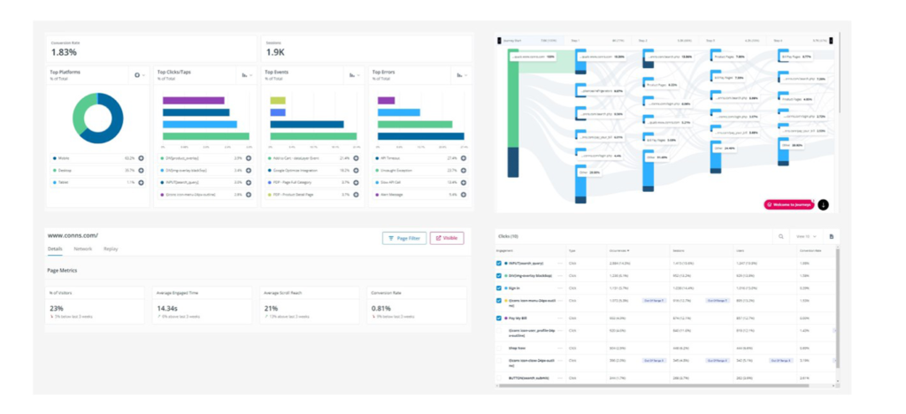
We were seeing above average drop off, reload and unclicked content on the homepage.
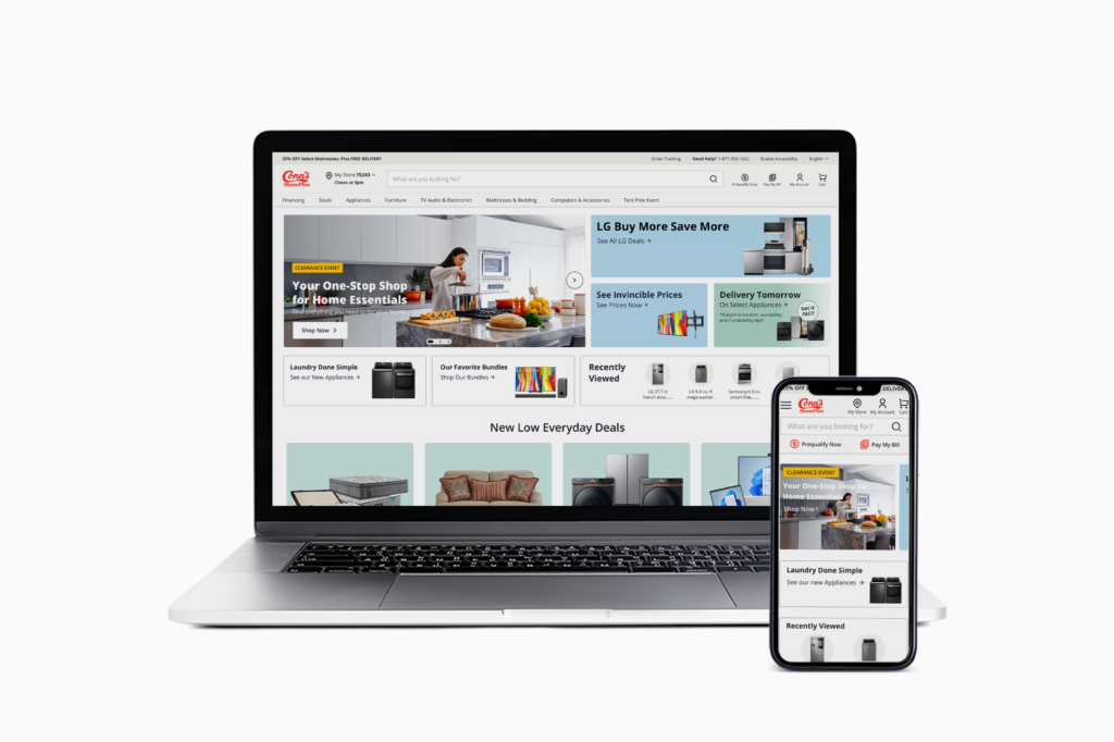
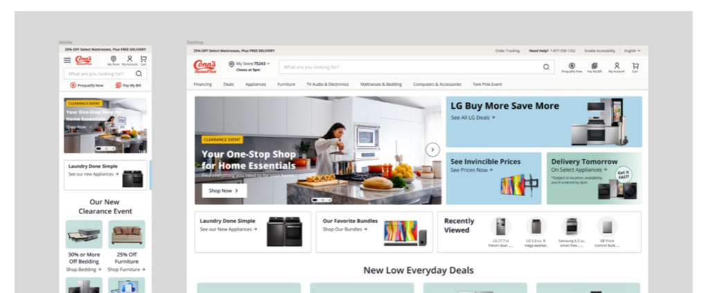
Current Design
Goals
Design the page as a whole instead of individual sections.
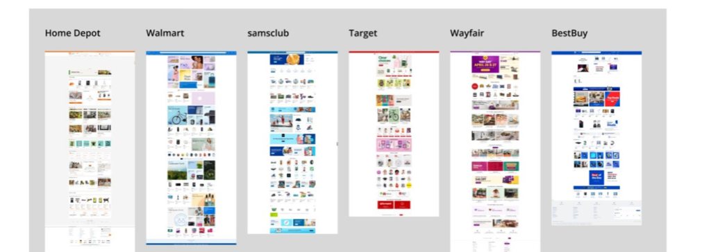
We used our metric program to analyze how our users interact with the homepage and where are they going in their user journey. We also did industry analysis to take a look how similar competitors were designing and using their homepage.
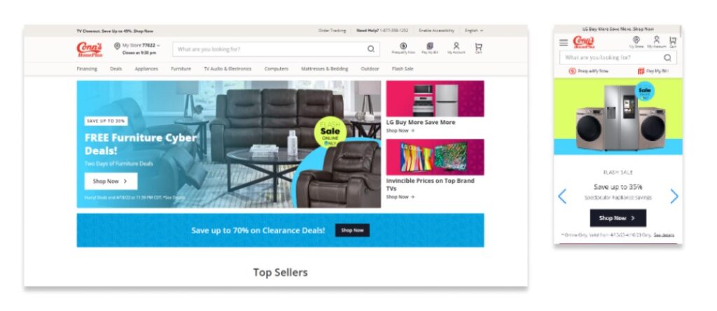
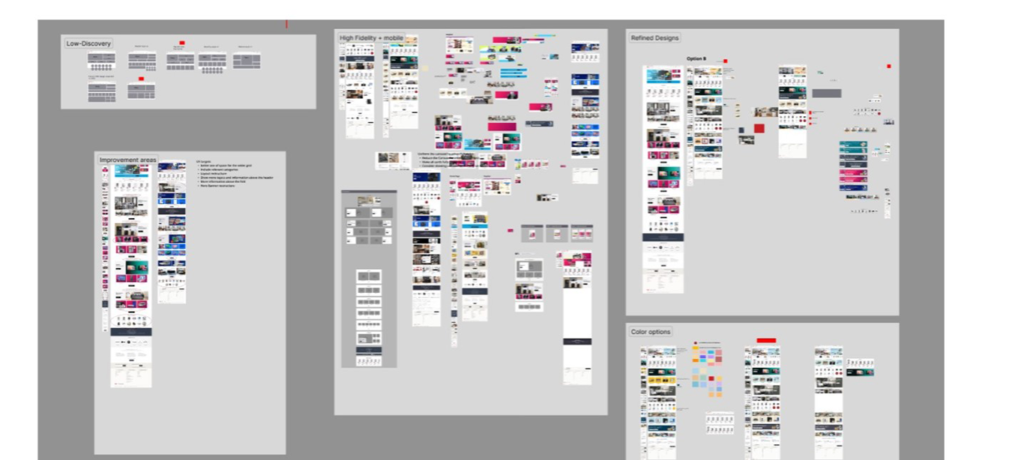
Using the data and competitive analysis above I started designing concepts. I first started with low fidelity designs to see how much I could fit in with the space above the fold. After I had the overall concept approved I went into High fidelity designs then matched with design concepts of color options and component designs.
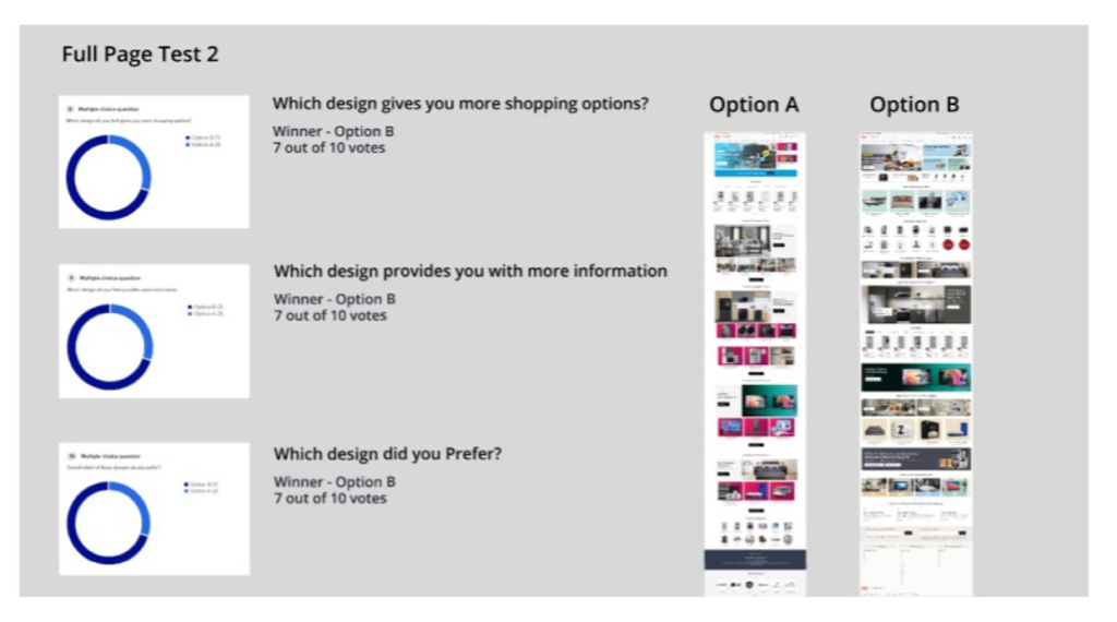
Once I had a full design approved I moved into the testing phase and launched a comparison test on user testing.com. I asked users multiples types of questions and focused on a multiple choice feedback with some fill in your answer prompts to get a better Idea on what design did they prefer and Why. Some of the questions and results are below.
Entire page designed together with each section having a purpose
Less drop off
Higher conversion
The new design was the high favorite in the test and it accomplished all of our set goals. The full prototype is available below if you wish to see the entire new experience.