Project overview: The ask was to complete design from front to end full online payment system experience. All additional scenarios included while also implementing a OTP system and text to verify design for the users. There was also a need to create a guest user flow on top of the recognized or logged in user flow.
Role
Dustin Neu – Sr UX/UI Designer
Tools
Figma, Quantum Metrics, Google Analytics, Usertesting.com
The Challenge
The challenge here was designing two different online systems. Since we were taking on a guest flow as well. I also needed to take on OTP and identity verification best practices and laws to make sure we could confirm the user. The experience before this was a 3rd party out of the box system.
How did the problem arise?
The problem arose mainly when we started getting report that our users were not able to see, link or make payments to their financial accounts. If a user missed a payment there were repercussions to their credit so making sure the system was flawless was the upmost priority. With that I started a design journey that not only took on the bill pay system but also how a user finds their account, links it and ultimately pay it.
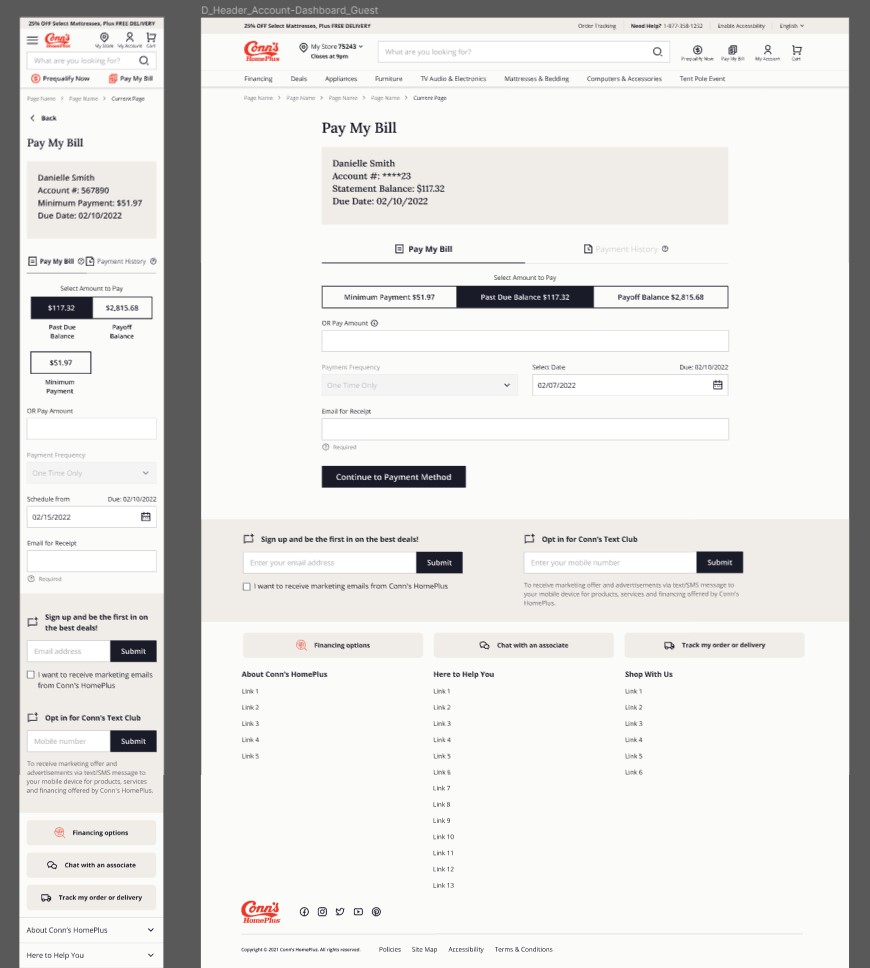
Old Experience Design
Goals
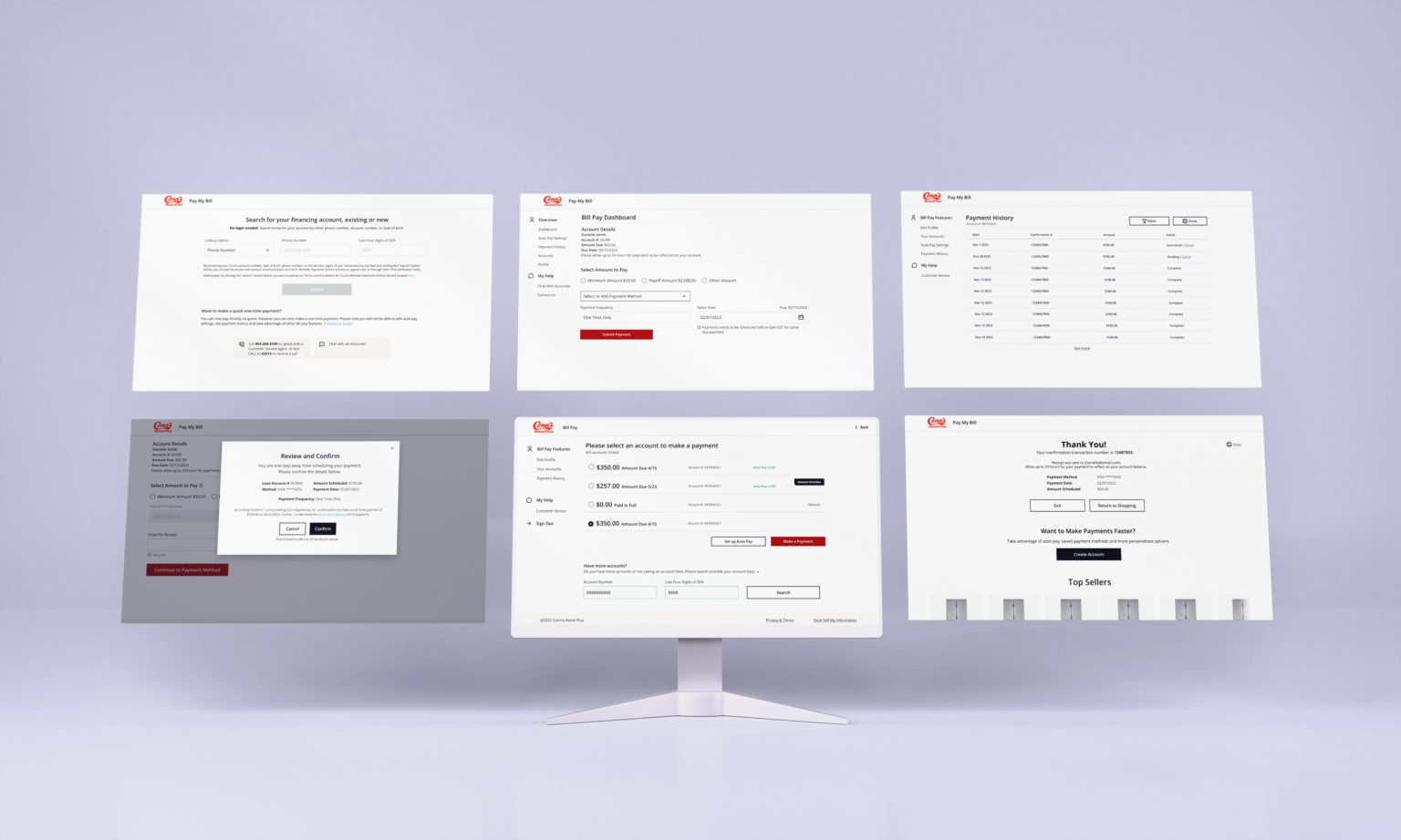
Design a full front to back online payment system
Design and incorporate OTP security and text to verify flows.
Bring in a guest flow that would allow users to make quick payments
Design a linking to account experience where users could search for their account and link them together.
Design an account look up that allowed our users to find their bill using multiple different methods. (SSN, Phone number, Account number)
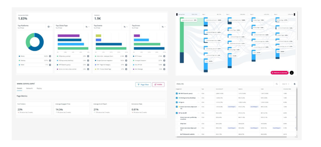
We used our metric program to analyze how our users interact with the old out of the box system. I also interview and got data from our call center letting me know how many calls were coming about issues for users paying their bills and linking their accounts.
Main Takeaways
High drop rate before bills payed.
High call center costs to tackle users paying over the phone %
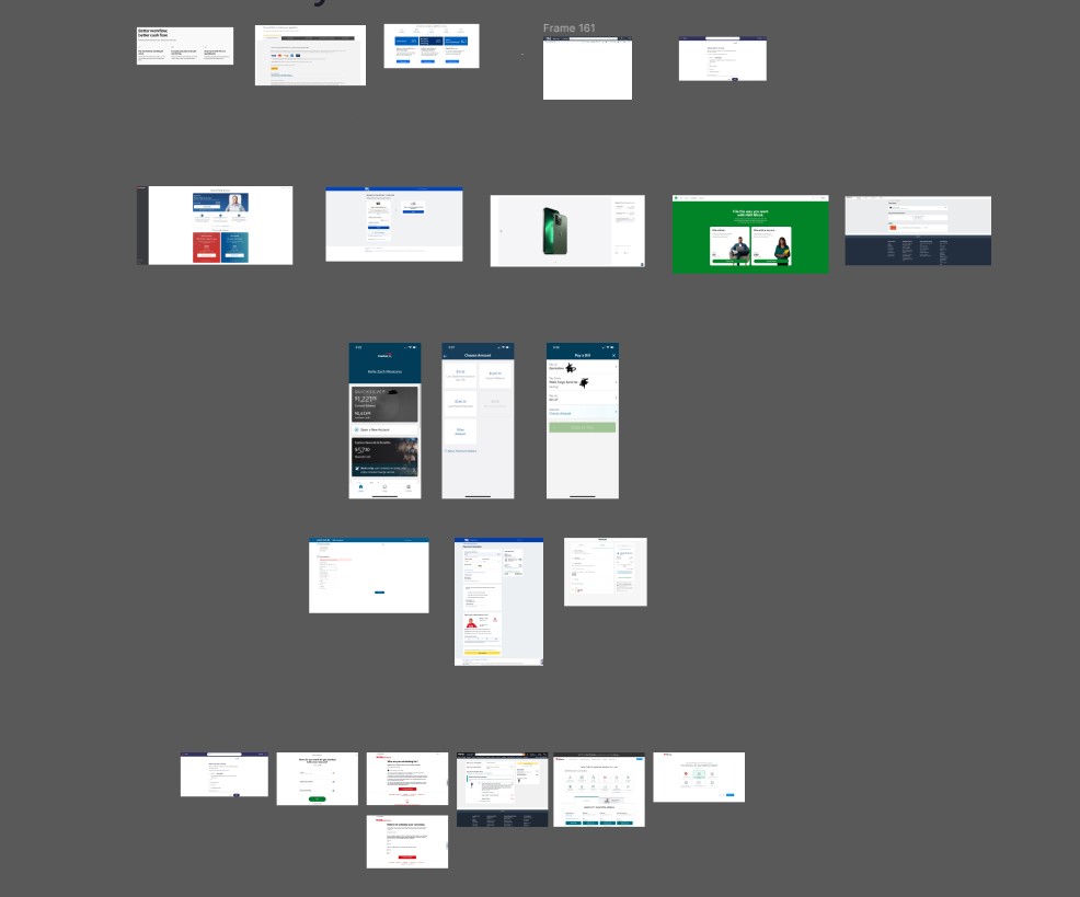
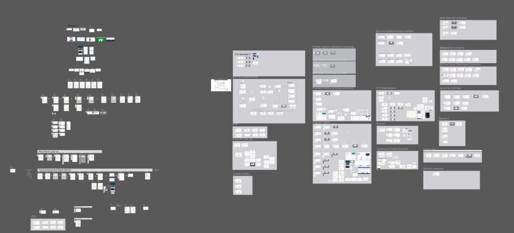
Using the data and competitive analysis above I started designing concepts. I first started with low fidelity designs to see how much I could fit in with the space above the fold. After I had the overall concept approved I went into High fidelity designs then matched with design concepts of color options and component designs. From there I started putting together multiple prototypes to launch for testing and user feedback. This was also approved by our legal and financing teams as well as showed and approved by the clients board of directors.
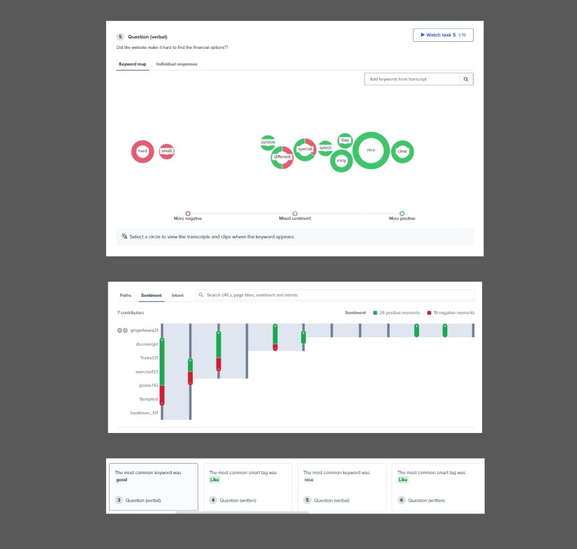
Once I had a full design approved I moved into the testing phase and launched a comparison test on user testing.com. I asked users multiples types of questions and focused on a multiple choice feedback with some fill in your answer prompts to get a better Idea on what design did they prefer and Why. Some of the questions and results are below.
We went from an average of 40 -50k users making payments a day to an average of 325k users a day making payments.
Call center queries went down
More features
The new design has been a huge success and its one of the projects I’m most proud of because it also affects users credit and having them make their payments with ease is one of the main reason I strive to give the user the best experience as possible.
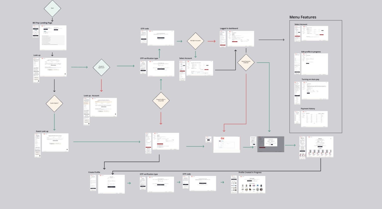
View the prototype?
Here is the link for the happy path prototype. In this flow I will take you through making a payment from start to finish. Click here for the Happy path prototype